Cointegration
On Edwin Chen’s personal website can be found one of the best and self-explanatory introductions to cointegration that I have ever read.
Suppose you see two drunks (i.e., two random walks) wandering around. The drunks don’t know each other (they’re independent), so there’s no meaningful relationship between their paths.But suppose instead you have a drunk walking with her dog. This time there is a connection. What’s the nature of this connection? Notice that although each path individually is still an unpredictable random walk, given the location of one of the drunk or dog, we have a pretty good idea of where the other is; that is, the distance between the two is fairly predictable. (For example, if the dog wanders too far away from his owner, she’ll tend to move in his direction to avoid losing him, so the two stay close together despite a tendency to wander around on their own.) We describe this relationship by saying that the drunk and her dog form a cointegrating pair.
http://blog.echen.me/2011/04/16/introduction-to-cointegration-and-pairs-trading/
For those who are not familiar with the term ‘random walk’, the following example may be helpful. Imagine that we start a walk from point A, every step has a different length and the direction could be left or right. If we make a graphic representation of our walk, the result will look familiar to any trader.
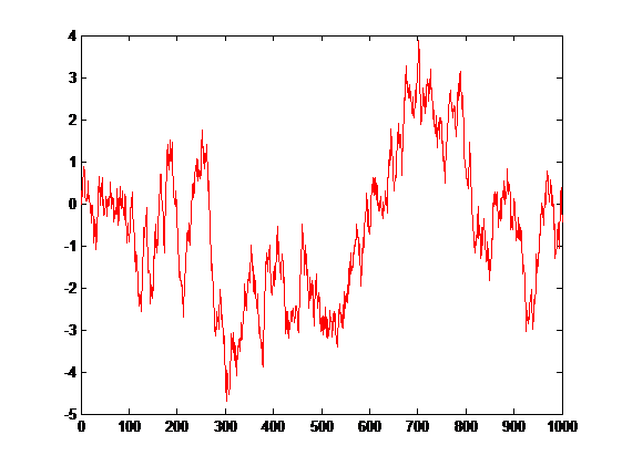
Figure 1
Starting from 0 and adding random values beetween -0.5 to 0.5 for every point we get the graph above. Does it ring a bell? I’m pretty sure many of us may see supports and resistances, even thinking this graphic was generated randomly.
Cointegration technique would fit under the umbrella of the so called mean reversion strategies. So to establish a successful trading strategy, we need to know how far apart from its mean is the price at any given time. Supposing we have a financial instrument with a price shape showing a pattern as follows .
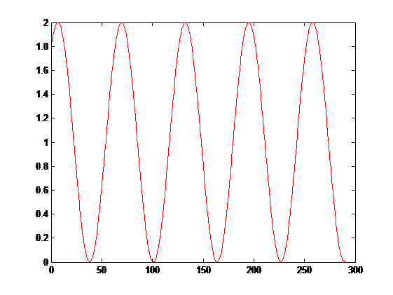
Figure 2
If you were asked to define a strategy to make a profit with this kind of movement in the price, what would you answer ?. The answer is simple , you would buy when the price is at minimum and you would sell when the price is at maximum, that’s it, that’s the basis of a mean reverting strategy. The minimum/maximum price zone is defined in relation with its own mean, in the example above the mean is 1. A price with this shape is an archetype of a mean reverting or stationary price series.
So we have to establish a measure of how far apart a price series is from its own mean.
If there were an instrument with this price shape our lives as a traders would be very simple, but of course, this kind of instruments doesn’t exists at all. The good news is that we can find instruments that once we buy or sell a proper amount of each one, the resulting combination draw a graph like the one above, in other words, we are going to create a virtual instrument as a linear combination of real ones and we are going to call this virtual instrument ‘Portfolio’.
Portfolio = (Buy OR Sell X Shares OF instrument A) AND (Buy OR Sell Y SHARES OF instrument B) AND (·········)
This virtual instrument by its nature is mean reverting or stationary.
So the big questions are,
- How can I know if a combination of instruments are cointegrated
- What kind of operations we should do and in what proportions, in other words, what amount of shares we have to buy or sell in order to get a cointegrated portfolio.
Next I’m going to introduce the most used mathematical methods in order to be able to answer this questions. I’m not going to dig into the mathematical details, this is out of the scope of this article, however at the end of this article there is a list of useful links and books if you want to know more about this.
The good news are that we don’t need to know the mathematics behind the methods deeply. As a trader I’m mainly interested in those aspects related with decisions making process and not into the mathematics itself.
Hurst Exponent
Hurst exponent calculation is based on price speed diffusion, and in the fact that this diffusion is slower from its original values than a comparable pure geometric random walk. Normally we are going to find defined with the H letter and it’s value is between 0 and 1. The main advantage of this indicator is related with the fact that we can get information about the current behaviour of price in the sense that we can know if we are under a mean reverting moment or in a trending moment.
Schematically,
H < 0.5, Price series is Mean reverting
H = 0.5, Price series describes a Random walk
H > 0.5, Price series is Trending
Let’s go see over an example with real stock data from yahoo finance using the R project. Have a look to the closing price behaviour of the USD/JPY pair from may to october of 2004.
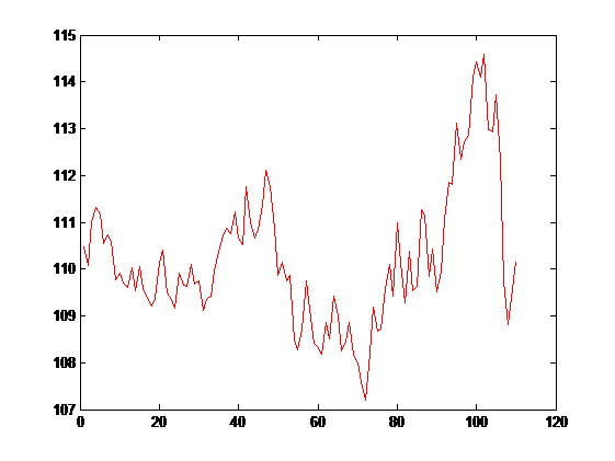
Figure 3
As we can see the price is moving around an average that ranges between 110 and 111, the hurst exponent of this price series is H = 0.3880, indicating that we are under a mean reverting period ( H < 0.5).
If we move towards a more recent moment of the same instrument from may to october of 2014, we found this closing price shape.
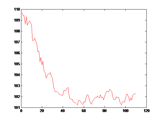
Figure 4
Again doing hurst exponent calculation we get a value of H = 0.5706, indicating that we are under a trending period ( H > 0.5). We can even use another useful tool, the so called Variance Test Ratio in order to get a measure of the reliability of the value calculated using the hurst exponent.
This is a useful parameter working in conjunction with others and it helps to establish a more solid trading signals generation.
Half life
By using the half life parameter we are be able to get the average amount of time needed for a mean reversion take place.
Its calculation is done using regression techniques by comparing the price series with a delayed copy of itself. The rule of thumb with this parameter is basically the lower the better. With lower values of half life we can trading safer because we are going to keep open positions less time.
Applying this concept over the example above we get a HL = 5.97, which is quite good.
Johansen Test
Johansen test and Augmented Dickey-Fuller test are the two main methods to study time series cointegration, although Johansen Test method has some advantages over the Augmented Dickey-Fuller test. With the Augmented Dickey-Fuller test we are limited to study a maximum of two instruments, in addition we have to be aware about the instruments order because in this case “the order of factors alter the product”.
By using the Johansen Test method we save this limitations being able to study more than two instruments at the same time, and we don’t have to be worried about the instrument order. To understand the power of this tool I’m going to introduce an example based first at all in two instruments, IGE (North American Natural Resources) and EEM (MSCI Emerging Markets) during the 2015 year.
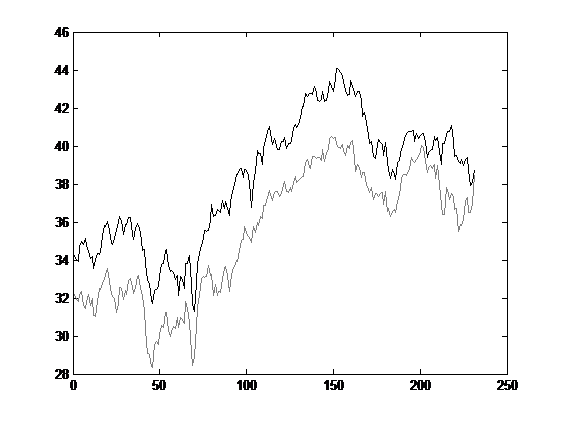
Figure 5
As we can see in the graph above IGE value is always below the EEM value but at a first glance we note that there is a relationship between the two instruments, once one of them go up the other one goes up too and vice versa. This is what we are looking for and the construction basis of our portfolio.
If we pass the portfolio formed with the two instruments IGE and EMM through the Johansen Test, we get the following results,
| Test Result | 90% | 95% | 99% | |
| r <= 0 | 17.02 | 13.4 | 15.49 | 19.93 |
Table 1
In order to interpret this results in a right way we have to compare the test result with the value in the other columns which is greather than the test value, in this case the test result is 17.02 which is greater than 15.49 but is below 19.93, so we have a probability of 95% that our portfolio is in fact Cointegrated, which is a very promising fact.
The other big question is a double question, we now know that we have probably a cointegrated portfolio formed by two real instruments, but how many shares we have to buy or sell of this real instruments?. In that sense the Johansen test give us the following results,
|
Instrument IGE |
Instrument EEM |
| 1.21 |
-0.29 |
Table 2
So in order to get a Cointegrated or Stationary Portfolio formed with the instruments IGE and EEM we have to BUY 1.21 Shares of IGE and SELL 0.29 shares of EEM. Note how the sign of the result is related with the kind of operation either buy or sell.
Yportfolio = 1.21 · IGE – 0.29 · EEM
If we now draw in a graph our portfolio we get the following result,
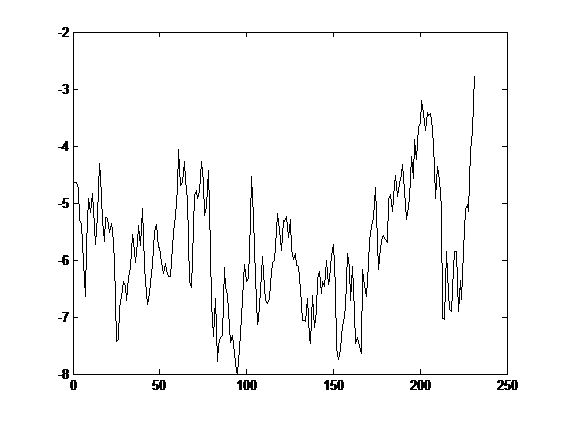
Figure 6
Which is pretty similar the the one presented in the figure 1.
Briefly we have been able to form a cointegrated serie and to do that we have formed a virtual instrument as a linear combination of two real ones. When we are talking about BUY our portfolio this really means BUY 1.21 shares of IGE and SELL 0.29 shares of EEM and when we are talking about SELL our portfolio this really means SELL 1.21 shares of IGE and BUY 0.29 shares of EEM. Easy isn’t it?.
The generalisation to more instrument is very straightforward, we have an unlimited combination of financial instruments at our disposal and the profitability of this strategy can be indeed very interesting.
In order to get this strategy working in one of the most used trading software, I have developed a Metatrader indicator which help me to put the focus in the strategy. The indicator show us the parameters exposed above like the Johansen Test results among others, in a intuitive and simple way.
Cointegration Indicator
The Cointegration indicator allow us to study up to 9 instruments, so we can construct a virtual portfolio of up to 9 real instruments available in our broker.
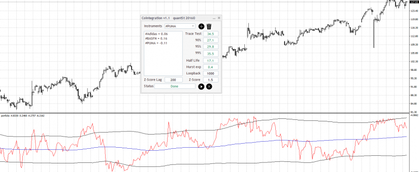
I’m going to introduce the indicator by using an example with the following instruments ADIDAS, BASFN and PUMA, 4 hours graph (4H), from the beginning of 2016 till the end of June (Brexit included).
To add an instrument in the study list we have to select it from the drop down list and then push the button with the plus symbol, on the other hand if we want to delete an instrument in the study list we only have to select the instrument and then push the trash button.
Once we have all the instruments selected in the study list, we only have to push the play button and then after a while we’ll get the Johansen test results, the hurst exponent and the half life. If we also want to view the portfolio’s graph shape we can add another included indicator the so called ‘portfolio’ indicator.
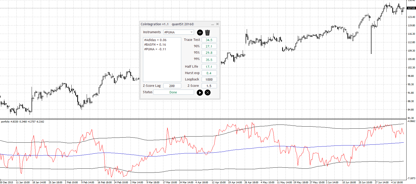
Figure 7
In the example described above and after the instruments have been introduced and processed we get the following results.
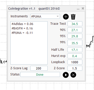
Figure 8
The Johansen Test give us a result of 34.5 which is greater than 29.8 but lower than 35.5 so our portfolio is cointegrated with at least 95% of confidence. Hurst Exponent give us a value of H = 0.4 being below of 0.5 ( H < 0.5) so therefore the series under the study is probably mean reverting and last but not least the Half life give us a value of 17.1 * 4H = 68,4 hours, a little bit less than three days, which is quite good. And our virtual instruments is constructed as follows.
Yportfolio = 0.06 · Adidas + 0.16 · BASFN – 0.11 · PUMA
We have to note that the study took place few days after Brexit. We can expect a lot of volatility under this circumstances, and the cointegration strategies doesn’t fit quite well under high volatility periods.
We have to look for areas where the portfolio value is far away from its mean. Note that the blue line is a simple moving average calculated with a period defined in the ZScoreLag parameter in the indicator window (In this case 200). The black lines are also defined in the indicator window and are calculated as a function of the Z-Score parameter. With this parameter we can establish the number of standard deviations that we consider the portfolio can move away from its mean. (In this case 1.5). This is based in the so called bollinger bands.
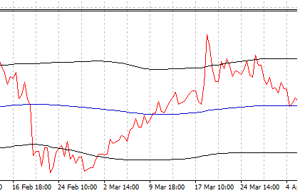
Figure 9
If we pay attention to the portfolio graph we can find a lot of market entry points, for example, if we put the focus in the end part of February we can see how the value of the portfolio is below -1.5 standard deviations away from its mean, if we’d have bought our virtual instrument in that moment, for example on 25/02/2016 at 14:00, we’d have had made the following operations.
BUY 0.06 Shares of Adidas at 98.88€/Share
BUY 0.16 Shares of BASFN at 59.12€/Share
SELL 0.11 Shares of PUMA at 194.60€/Share
If we establish a logic point to get out of market, for example, around on 09/03/2016 at 18:00 and in that moment we close all the operations done above. It would have been a profitable trade?, Let check it out,
| Instrument | Operation | P/L |
| BASFN | 0.16 · (64.36 – 59.12) | 0.8384€ |
| ADIDAS | 0.06 · (96.49 – 98.88) | -0.1434 |
| PUMA | 0.11 · (194.60 – 194.30) | 0.033 |
Table 3
The total Profit would have been 0.728€, which is relatively good if we take into account the number of shares bought or sold. Logically in our trading basis, we are going to buy or sell an integer number of shares therefore if we buy 100 shares of BASFN, we should buy 40 shares of Adidas and we should sell 70 shares of PUMA to keep the linear relation between them. That way we get a Profit of 449.40€.
Although you can use up to 9 instruments, I recommend not to use more than three or four with a solid cointegration factor in order to keep the commissions and fees as low as possible.
I’d like to share some advices about this indicator and the cointegration strategies. Something which we can call the three golden rules. The success is tightly related with the follow of this three rules.
Rule 1
We must note that the stationarity of the pattern has lasted long enough to feel confident about the reliability of the cointegration. The average has to be as flat as possible and the portfolio’s value has to be inside the channel formed by the bollinger bands.
Some authors say that a value of two standard deviations is a suitable one, but personally, I suggest a value around 1.3-1.7.
Rule 2
We must enter to the market not only when the portfolio has far away from its mean and has passed our bollinger bands but also when the portfolio has started to revert to its mean. Of course that’s easier to say than to do, the key is enter to the market not only once the portfolio’s value has passed the bollinger bands but to wait until the value shows clear sign of trend inversion and in fact this new trend towards its mean has started.
Rule 3
What about our Stop loss?. In this case, we are working with a virtual instrument so we can’t apply a traditional stop loss to protect ourself from market movements against us. We have to monitor our portfolio’s trend, if we incur in a loss or we suffer a drawdown beyond a predetermined level this is the sign to close the operations. we have to accept small losses sometimes. We have to keep us emotionally far away the market.
Some useful tips and tricks,
-
We have to be very careful about news. The cointegration based strategies are very sensitive to the volatility, as a rule of thumb we have to be out of market if something important is about to happen. The more stable the market the more profitable the strategy.
-
The Quality of data is very important, we have to be aware that in order to generate the portfolio the data of the real instruments have to be synchronized to each other. we are only able to compare data of the same day/time.
-
The best time frames are those between 30M and 1D, generally speaking there is too much noise below 30M and on the other hand for time frames above 1D the duration of the mean reversion can take too long, which is not advisable for a retail trader.
P.D: Please note that all instruments used in the study must be under the same purchasing currency in order to be compared.
Demostration Video
(This Video is only for demonstration purpose and not represent an advice in any way)
References
- Pairs Trading using cointegration approach. MasterThesis (2012)
- https://ses.library.usyd.edu.au/bitstream/2123/4072/1/Thesis_Schmidt.pdf
- http://uir.unisa.ac.za/bitstream/handle/10500/4821/thesis_ssekuma_r.pdf?sequence=1
0 Comments